Online Forums
Technical support is provided through Support Forums below. Anybody can view them; you need to Register/Login to our site (see links in upper right corner) in order to Post questions. You do not have to be a licensed user of our product.
Please read Rules for forum posts before reporting your issue or asking a question. OPC Labs team is actively monitoring the forums, and replies as soon as possible. Various technical information can also be found in our Knowledge Base. For your convenience, we have also assembled a Frequently Asked Questions page.
Do not use the Contact page for technical issues.
- Forum
- Discussions
- QuickOPC-UA in COM
- Discovery, Browsing, Browse Dialogs and Controls
- Restrict browsing to nodes / do not display attributes
Restrict browsing to nodes / do not display attributes
Added IncludeProperties property to UABrowseMode and UADataDialog. Determines whether Property nodes will be included in browse results.
(from kb.opclabs.com/What%27s_new_in_QuickOPC_2017.1 ).
Also, the button look-and-feel has been changed - hopefully to the better.
Regards
Please Log in or Create an account to join the conversation.
Please Log in or Create an account to join the conversation.
- m.baumgartner
- Topic Author
- Visitor
-

If you ask me, there might be 2 things you could do to make it more clear.
1) Make the "up arrow" and "down arrow" buttons more visible, by making them a bit larger and putting colored icons. They feel like disabled right now. Attention is taken by the middle button.
2) Introduce a boolean parameters to the invocation of the dialog where we can choose to not show the middle button. This way it would be very clear.
Thanks again for your help.
Please Log in or Create an account to join the conversation.
In this case, it's just a misunderstanding. The button you are using adds the currently selected node, and everything that's under it, recursively. In fact, this can get somewhat dangerous at times, if there are many nodes involved.
The primary tool to select nodes "one by one" should be the button to the left - a simple down-arrow.
Maybe the user interface is misleading a bit? But how to make it better?
Please Log in or Create an account to join the conversation.
- m.baumgartner
- Topic Author
- Visitor
-

Just so you know, it's not just about being able to see the properties on the right hand side of the form.
What we think introduce confusion is that when you select a tag node and click the button to add it to the "selected nodes" field, it also automatically add all it's property.
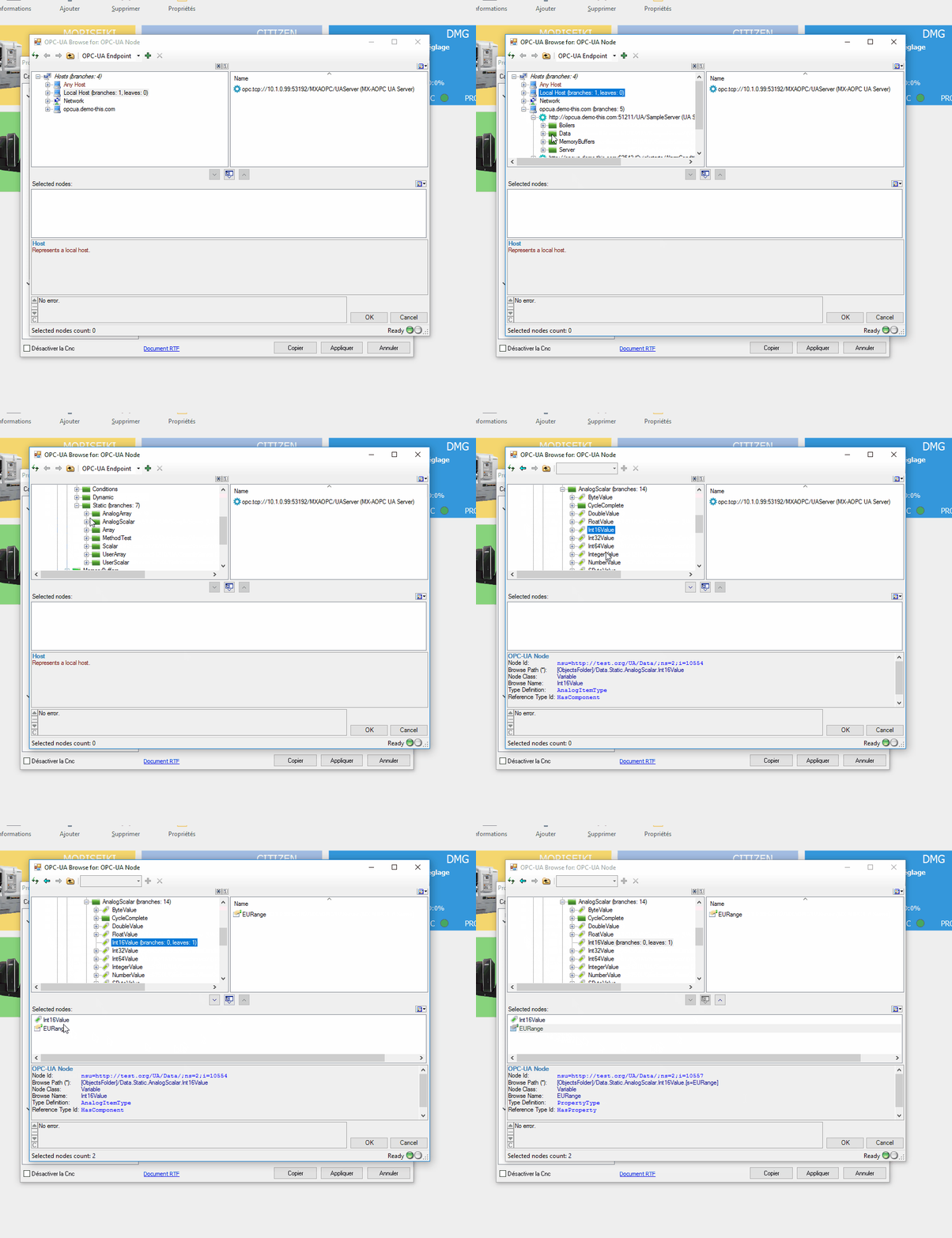
As you can see in the UA gif, when Int16Value is selected, EURange is automatically added to the "selection nodes" section.
If the user is to select 3 or 4 tags in it's multi-selection process, it might get quickly confusing to see all properties of all tags in that single field.
Hope i'm being clear.
Please Log in or Create an account to join the conversation.
This pre-made UABrowseDialog dialog, however, currently does not have a way to exclude nodes that are Properties. It is a useful suggestion, though.
I will make a note and see what we can do about it. There is a chance to have this implemented into the upcoming version (2017.1), which might be released in July. Your license is purchased with a maintenance, so the new version will be free of charge for you.
I cannot promise it, but take it with higher than 50% chance that the feature will be there.
Note that in my view, the Property nodes are not that "bad" or distracting as you may think. In fact, by hiding them, you risk that some important information would then become inaccessible to the users. I have a feeling (but have not verified it) that, for example, some companion (sector-specific) UA specifications make heavier use of Property nodes for their data.
Regards
Please Log in or Create an account to join the conversation.
- m.baumgartner
- Topic Author
- Visitor
-

Is there a way to not show theses "Properties" then?
PS : I'm glad the gifs made it faster for you to understand
Mathieu
Please Log in or Create an account to join the conversation.
If you want to see what attributes are, make a reverse experiment, and set the SelectElementType to UAElementType_Attribute.
BTW, I enjoyed your animated GIFs so much. That's very practical. May I ask which software you use to create them?
Best regards
Please Log in or Create an account to join the conversation.
- m.baumgartner
- Topic Author
- Visitor
-

Here is the code i'm using (delphi) :
 BrowseDialog := TUABrowseDialog.Create(nil);
 BrowseDialog.Mode.SelectElementType := UAElementType_Node;
 //BrowseDialog.Mode.SelectableNodeClasses := UANodeClass_Variable;
  BrowseDialog.Mode.MultiSelect := true;
  BrowseDialog.ShowDialog(nil);
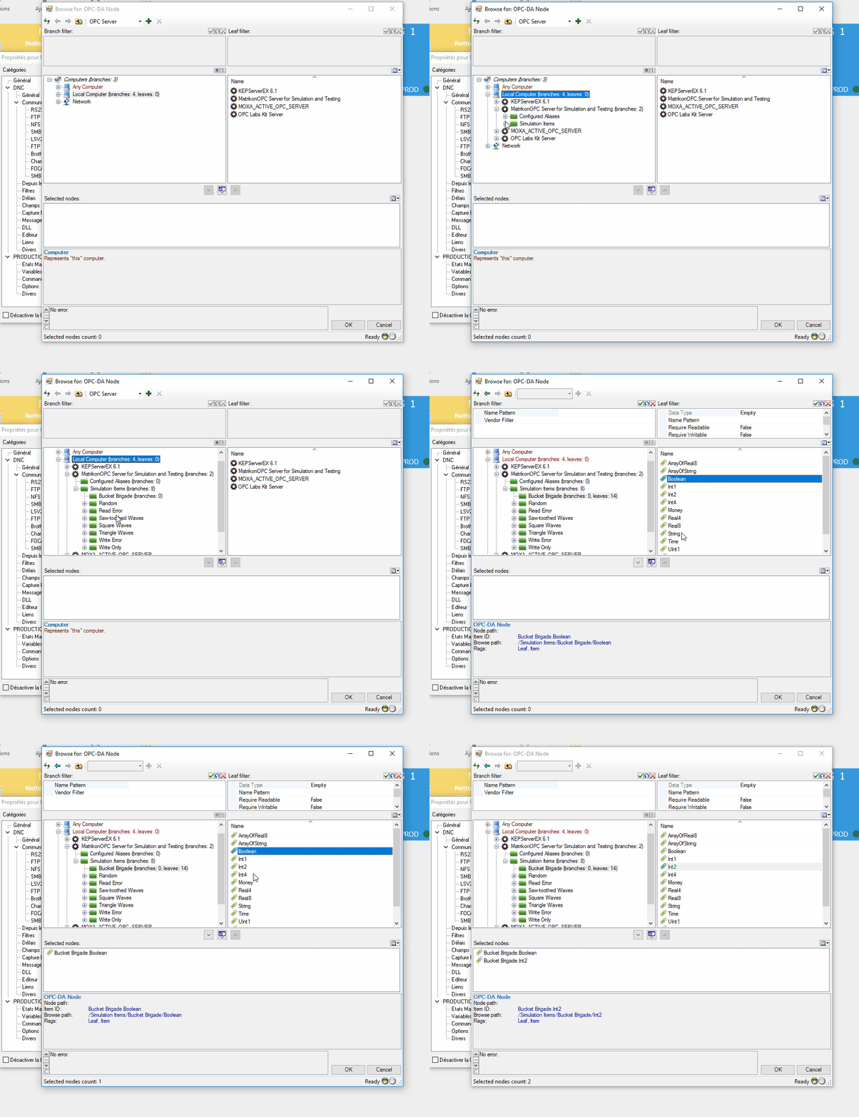
you can find attached a gif of the result in OPC UA and DA.
in DA we don't see the attributes.
in UA we see them.
We just bought QuickOPC a few weeks back so we're using a very "fresh" version but i don't know exactly which. I could check if that can make a major difference.
Please Log in or Create an account to join the conversation.
yes, with Mode.SelectElementType "Node", the attributes should be hidden.
Are you saying that this is not the case?
Which QuickOPC version are you using?
Best regards
Please Log in or Create an account to join the conversation.
- Forum
- Discussions
- QuickOPC-UA in COM
- Discovery, Browsing, Browse Dialogs and Controls
- Restrict browsing to nodes / do not display attributes


